

The Pandemic Vulnerability Index (PVI) was a valuable research tool for analyzing COVID-19 data collected and curated between March 2020 and March 2023.
The population-level data available in the PVI remains a powerful resource for understanding how the COVID-19 virus spreads and which communities were at greater risk. The data visualization in the PVI Dashboard addressed the challenges of interpreting this data and enables its effective communication to scientists, policymakers, and the public.
As the pandemic progressed, the PVI model was updated. As data became available for vaccination rates at the local level, the Dashboard was enhanced to include vaccination as an intervention. The initial PVI model was available from March 2, 2020, and the updated model including vaccination rates was available from January 21, 2021. Please note that data is no longer being added to the PVI.
At this time, the compiled PVI data is offered as downloads for research.
The NIEHS COVID-19 PVI
Although no longer available for use, the PVI tool had several controls and views. Knowledge of these dashboards may serve to inform future projects.
The PVI:
- The data visualization in the PVI Dashboard addresses the challenges of interpreting this data and enabled its effective communication to scientists, policymakers, and the public.
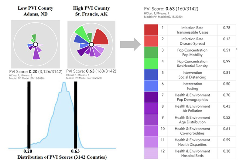
- This Dashboard created risk profiles, called PVI Scorecards, for each county in the United States. The PVI summarized and visualizes overall risk in a radar chart, which is a type of pie chart with various data sources comprising each slice of the pie. The Dashboard was continuously updated with the latest data from March 15, 2020 through March 23, 2023.
- As the pandemic progressed, the PVI model was updated. As data became available for vaccination rates at the local level, the Dashboard was enhanced to include vaccination as an intervention. Users could view PVI models with or without vaccination rates.
- The default display settings showed radar charts for the top 250 counties by overall PVI score. Users could adjust the number of charts displayed and specify which counties to display.
- Users could zoom into individual counties by name.
- Users could view PVI models with or without vaccination
- Each slice of a radar chart, or PVI profile, represented a different data source. The information from each slice was s combined to generate a PVI score for each county. This option allowed users to simultaneously view the magnitude and source(s) of vulnerability.
- Cumulative case and death counts could be displayed by county.
- The Change Map option allowed users to change the map display. The default dark gray map could be changed to several options that included satellite images and topology.
- The COVID-19 Legend option allowed users to change the COVID-19 Layers display of the map, namely the colors and dot sizes indicating case and death counts.
- The PVI Model Filter options allowed users to create complex queries, or subsets, of information. Among the options were the following:
- Limit the number of scorecards displayed
- Change how the displayed scorecards are ordered
- Specify counties by name to display
- Specify clusters of similar PVI profiles
- Restrict ranges for a slice or overall scores
- Counties could be clustered based on PVI similarity with two types of clustering: hierarchical, or HClust, and KMeans.
- Using the Settings Summary option, users could save and retrieve settings from previous Dashboard navigation sessions, automating the re-evaluation of previous visualizations and filtering selections.
Details of Final Models
The datasets (i.e., components) comprising models 11.2 and 12.4 are described below. The main difference between the models is the inclusion of vaccination data (and subsequent re-weighting) in model 12.4. For both models, each component is assigned to an indicator (data slice) categorized into four domains: Infection Rate, Population Concentration, Intervention Measures, and Health & Environment. The expanded tables include a description of each component, the rationale for its inclusion, and a link to the public data source. Details of the methods used to build and assess the PVI are provided below.
The time-series data underlying the current model are available at github.com/COVID19PVI/data. The software used to generate PVI scores and profiles from these data is freely available at toxpi.org.
The PVI was developed to summarize and communicate complex, high-dimensional data related to communities’ vulnerability to COVID-19. The corresponding scorecards are human-centric and focus on impacts at the community level. Accordingly, data were apportioned into slices using a combination of quantitative modeling and prior knowledge of risk drivers.
While the general PVI model communicates an integrated concept of vulnerability, purpose-built forecasting models were used to predict case and death numbers. Predictive modeling for both COVID-19 cases and deaths presents several unique challenges. Unlike other airborne viruses (e.g., influenza), testing methods and best medical practices for this contagion quickly evolved during the pandemic. Tests were initially limited to those presenting severe symptoms, testing practices differed by geographic region, and testing became more widely available as the pandemic progressed and resources became available. As a result, it is difficult to compare the observed number of cases per population and deaths per case across time or geographic areas. To accurately predict future cases and deaths, it was necessary to account for the fluid nature of the data.
Accordingly, the team developed a Bayesian spatiotemporal random-effects model that jointly describes the log-observed and log-death counts to build local forecasts. In this model, log-observed cases for a given day are predicted using known covariates (e.g., population density, social distancing metrics), a spatiotemporal random-effect smoothing component, and the time-weighted average number of cases for these counts. This smoothed time-weighted average is related to a Euler approximation of a differential equation; it provides modeling flexibility while approximating potential mechanistic models of disease spread. The smoothed case estimates are used in a similar spatiotemporal model to predict future log-death counts based on a geometric mean estimate of the number of observed cases for the previous seven days as well as other data streams. Figure 1 displays the resulting county-level predictions and corresponding confidence intervals.
A paper describing the Dashboard and the underlying methods is available at Environmental Health Perspectives.
Project Team
The COVID-19 Pandemic Vulnerability Index (PVI) Dashboard was collaboratively developed by scientists from NIEHS, North Carolina State University, and Texas A&M University.
NIEHS: John House, Matthew Wheeler, and Alison Motsinger-Reif
NC State University: Skylar Marvel, Fred Wright, Yihui Zhou, Kuncheng Song and David Reif
Texas A&M University: Weihsueh Chiu and Ivan Rusyn
Contact

Alison A. Motsinger-Reif, Ph.D.
[email protected]