


Welcome the Pandemic Vulnerability Index (PVI), a valuable research tool for analyzing COVID-19 data collected and curated between March 2020 and March 2023.
The population-level data available in the PVI remains a powerful resource for understanding how the COVID-19 virus spreads and which communities were at greater risk. The data visualization in the PVI Dashboard addresses the challenges of interpreting this data and enables its effective communication to scientists, policymakers, and the public.
This Dashboard creates risk profiles, called PVI Scorecards, for each county in the United States. The PVI summarizes and visualizes overall risk in a radar chart, which is a type of pie chart with various data sources comprising each slice of the pie. The Dashboard was continuously updated with the latest data from March 15, 2020 through March 23, 2023, and PVI Scorecards can be displayed for each date in this range.
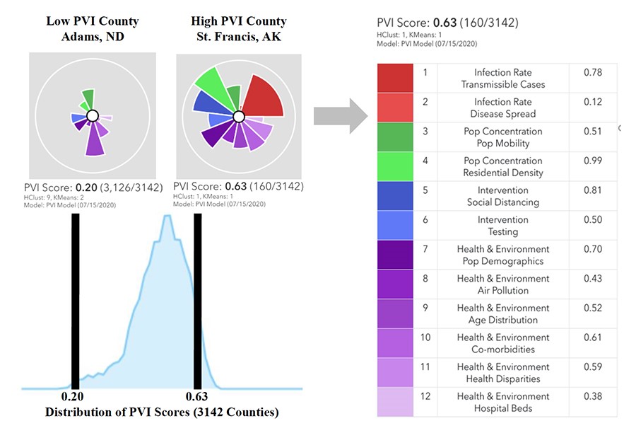
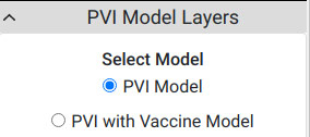
As the pandemic progressed, the PVI model was updated. As data became available for vaccination rates at the local level, the Dashboard was enhanced to include vaccination as an intervention. Users can view PVI models with or without vaccination rates with the option shown below. The initial PVI model was available from March 2, 2020, and the updated model including vaccination rates was available from January 21, 2021. Please note that data is no longer being added to the PVI.
The instructions below describe navigation of the COVID-19 PVI Dashboard.
Dashboard Map
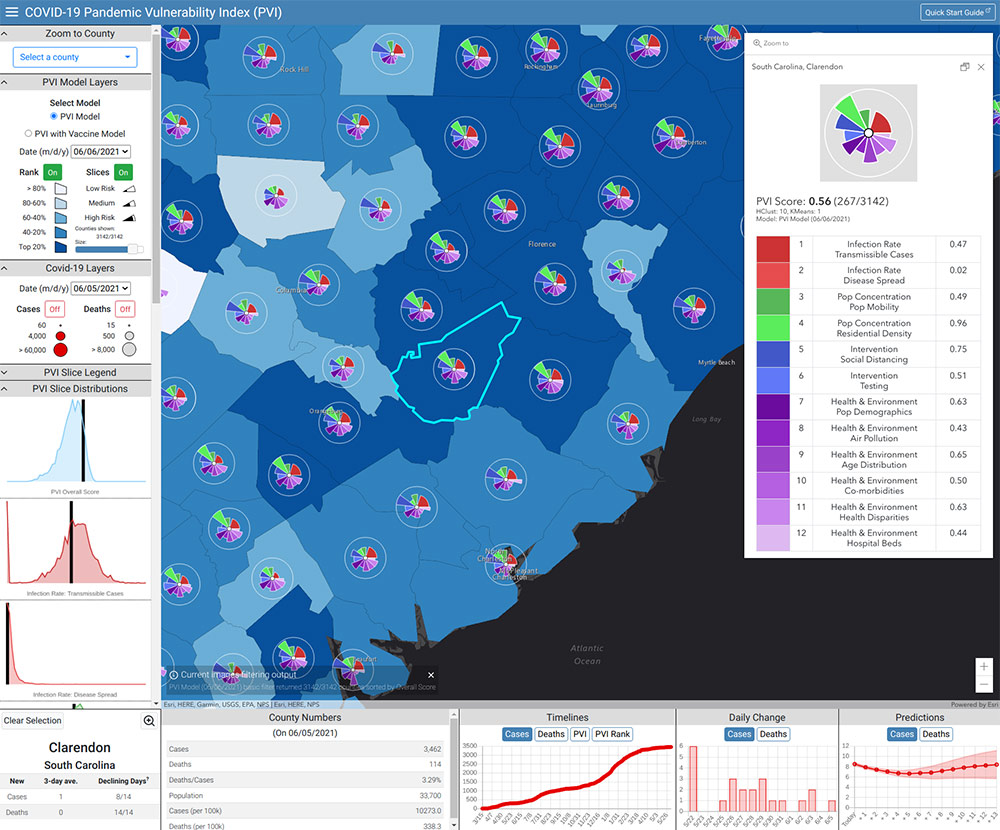
The blue shading on the Dashboard Map displayed in Figure 1 corresponds to the overall PVI value for each county, with darker shading indicating a higher score. Users can click on a county for additional data, regardless of whether a PVI profile is already shown. The default display settings show radar charts for the top 250 counties by overall PVI score. Users can adjust the number of charts displayed and specify which counties to display in the Quick Filter box in the upper-left corner.
The Dashboard offers many options for exploring underlying sources of vulnerability.
Zoom to County
 Users can zoom into individual counties by name using this option.
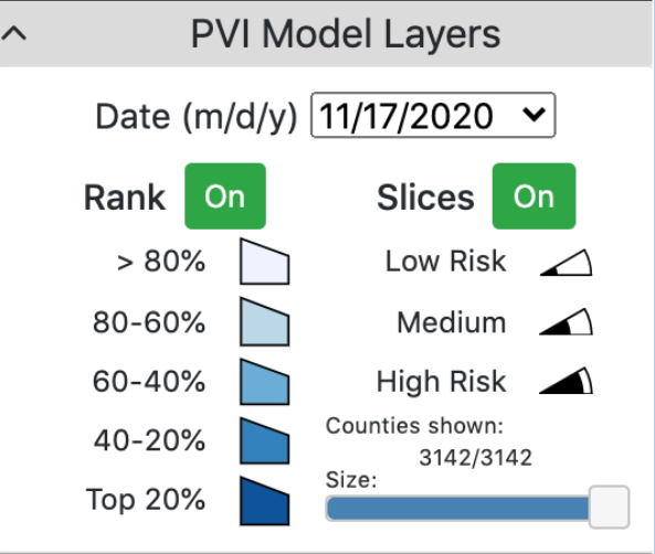
PVI Model Layers
Users can view PVI models with or without vaccination rates with the option shown below.
Users can select the date for which they want to view the Dashboard with a drop-down menu. The Rank option is selected by default and can be toggled on and off. The Slices option can also be toggled on and off and displays the radar charts that visually summarize a county’s overall vulnerability to COVID-19. Each slice of a radar chart, or PVI profile, represents a different data source. The information from each slice is combined to generate a PVI score for each county. This option allows users to simultaneously view the magnitude and source(s) of vulnerability.
COVID-19 Layers
Cumulative case and death counts can be displayed by county. This option can be toggled on and off for cases and deaths individually. Users can select the date for which they want this data displayed.
Using the box in the lower-right corner and the mouse pointer, users can zoom in on any part of a county and border lines will appear. Clicking on a county or PVI profile displays a county scorecard in the map pane.
PVI Slice Legend
This displays a legend delineating each slice by color.
PVI Slice Distributions
This option displays slice distributions for the selected county and selected date. The black lines indicate where the selected county is located among all counties for each PVI slice.
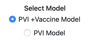
PVI Scorecards
Using model 11.2, generated on July 15, 2020 for St. Francis County in Arkansas and Adams County in North Dakota, this section explains the PVI Scorecards.
The left side of Figure 2 is a PVI score distribution. The vertical black lines indicate a county’s PVI Score compared to other counties. Counties with low vulnerability to COVID-19 appear on the left, and counties with high vulnerability appear on the right. The radar plots provide information about the 12 slices comprising the PVI score.
The right side of Figure 2 is a PVI Scorecard for St. Francis County that shows data sources and a legend for identifying individual slices by color. Infection rates, depicted in red and labeled 1 and 2, and intervention rates, depicted in blue and labeled 5 and 6, are highly variable and were updated daily through March 2023. Population concentration and density, depicted in green and labeled 3 and 4, are fixed values describing general demographic information. Health and environmental variables, depicted in purple and labeled 7-12 are also fixed values.
Navigating the Dashboard
Using the advanced menu options in the upper-left corner,
 , users can search the map and customize the display.

The Change Map option allows users to change the map display. The default dark gray map can be changed to several options that include satellite images and topology.

The COVID-19 Legend option allows users to change the COVID-19 Layers display of the map, namely the colors and dot sizes indicating case and death counts.

The PVI Model Legend menu allows users to adjust the size and opacity of the graphics displayed on the map.

The PVI Model Filter options allow users to create complex queries, or subsets, of information. Among the options are the following:
- Limit the number of scorecards displayed
- Change how the displayed scorecards are ordered
- Specify counties by name to display
- Specify clusters of similar PVI profiles
- Restrict ranges for a slice or overall scores
The default scorecard order is by overall PVI. Users can change the order by individual data slice rank. The Specify Names box allows users to select multiple counties of interest, and the Specify Clusters option allows users to select similar PVI profiles or form a cluster of counties.
Many of the filter options can be used simultaneously, so users should be aware of selections made across options.

Counties can be clustered based on PVI similarity with two types of clustering: hierarchical, or HClust, and KMeans. Cluster membership is noted on the Scorecard for each county.
Hierarchical clustering, as the name suggests, is an algorithm that builds a hierarchy of clusters. This algorithm first assigns all data points to a cluster. The two nearest clusters are then merged into a single same cluster. This algorithm terminates when there is a single cluster remaining. The KMeans clustering algorithm finds the optimal grouping of counties for a set number of clusters.
Users can click on the cluster numbers to display only the counties within a particular cluster. This displays only counties with similar vulnerability profiles.

Using the Settings Summary option, users can save and retrieve settings from previous Dashboard navigation sessions, automating the re-evaluation of previous visualizations and filtering selections.
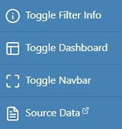
Toggle options allow users to remove from the display the three panels shown to maximize the map for high-resolution viewing.
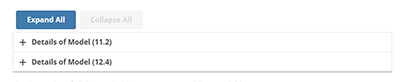
Details of the current PVI, including model documentation, data sources, and performance evaluation, are available on the Details webpage.
The Source Data option is linked to the GitHub repository of all daily PVI data files.
Users can select the PVI model of interest for details on the individual components included in PVI Model 11.2 or PVI with Vaccination Model 12.4.
Clicking on any county on the map populates the county display box in the lower-left corner and county-specific information panels at the bottom of the page. The display box shows the three-day average of new cases and deaths and the number of declining days, which is the number of days over the previous 14 days for which the number of new cases/deaths declined or remain unchanged relative to the previous day. The magnifier icon in the upper-right corner of the county display box centers the map and zooms in to the selected county.
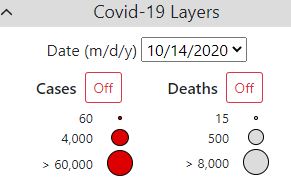
Cumulative data on observed cases and deaths is available from March 15, 2020. The Covid-19 Legend menu provides additional options for adjusting this display layer.

The observed number of cases and deaths for the selected county is shown for the previous 14 days.

The predicted number of cases and deaths for a 14-day horizon is plotted as a line surrounded by a shaded confidence interval.
A paper describing the Dashboard and the underlying methods is available at Environmental Health Perspectives.
Project Team
The COVID-19 Pandemic Vulnerability Index (PVI) Dashboard was collaboratively developed by scientists from NIEHS, North Carolina State University, and Texas A&M University.
NIEHS: John House, Matthew Wheeler, and Alison Motsinger-Reif
NC State University: Skylar Marvel, Fred Wright, Yihui Zhou, Kuncheng Song and David Reif
Texas A&M University: Weihsueh Chiu and Ivan Rusyn
Contact
Contact Alison A. Motsinger-Reif, Ph.D., chief of the NIEHS Biostatistics and Computational Biology Branch, with questions about this application.